Overview
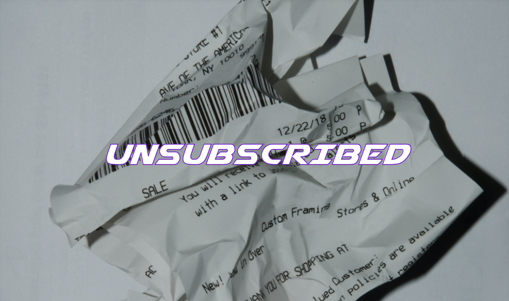
UNSUBSCRIBED is an application that helps solve a problem that most of all fall victim to. We all have fallen for the trap of a free subscription trial. The ever so tempting seven day, two week or even one month free trial to that meal delivery app or TV show streaming website. Some remember to deactivate their account before being charged but most of us do not. While $10 a month may not seem like much to some, when you multiply that times five or even eight different subscriptions, it adds up quickly. This shows that there is a problem that needs resolving in the department of forgotten subscriptions.
Problem Statement
This project needed to happen because of the amount of people who are wasting unnecessary money on subscriptions that they are not using. Users need one app that can break down their monthly services so that they know what they really need and do not need.
Users & Audience
The audience is anyone with a smartphone and people who have monthly subscription services that they might have forgotten about. The age range could be quite wide. For this particular product we left the age range between the ages of 25 to 60 years old.
User Flow
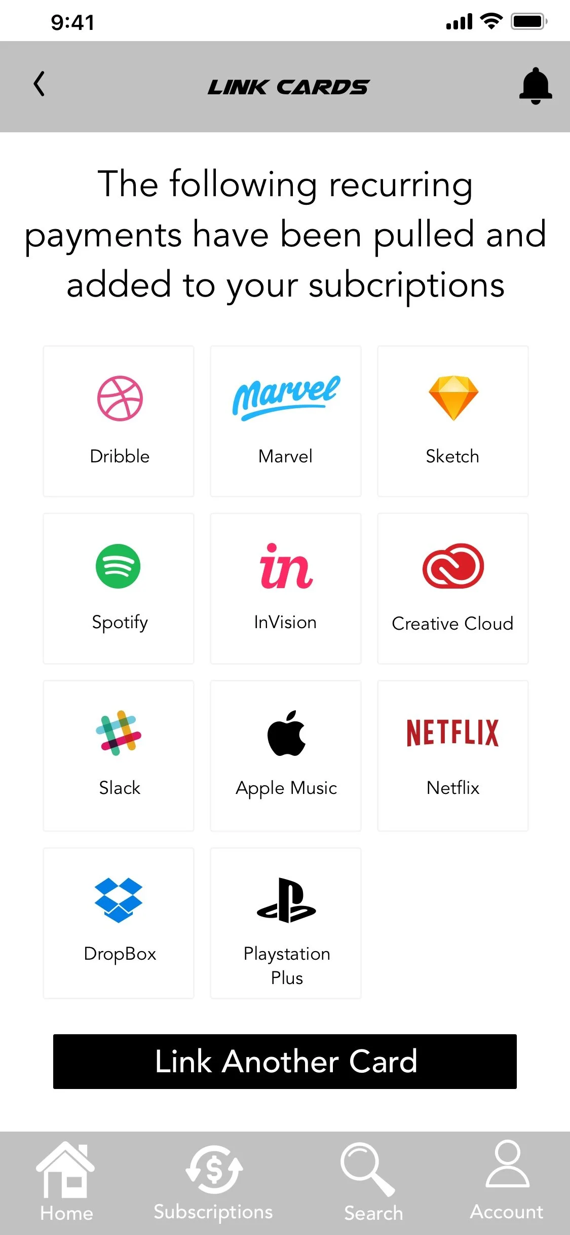
At the earlier stages of the design process, user flows were completed. This broke down the main steps that the users will be taking to complete the card linking process as well as view all of their subscriptions and be able to cancel one with ease. We completed these user flows because they would break everything down from the buttons the users would click and the pages they would get to. The user flows put us in the mind of the user and exactly how to make the application in the most user friendly manner.

Click the button below to get a closer look
User Interviews
The research process was conducted to understand the mind and lifestyle of the potential users of UNSUBSCRIBED. We conducted interviews, via survey on five users, male and female within the age range of 25 to 60. The questions included generic questions about the user such as their name, age and occupation, while also incorporating questions about their spending habits, subscription services and how well they are tracking their finances. This allowed us to get more of an understanding of the users and what their intentions would be behind using the application.
We chose the interview method because it was the best method to truly understand the reason why our users would download and utilize the app. The survey and interviews allowed us to realize just how many people have the same issues. This whole process helped us learn that and that allowed us to make alterations to the early plans.
Click here to see the research plan:
Click here to see the interview questions:
Click here to see the research synthesis:
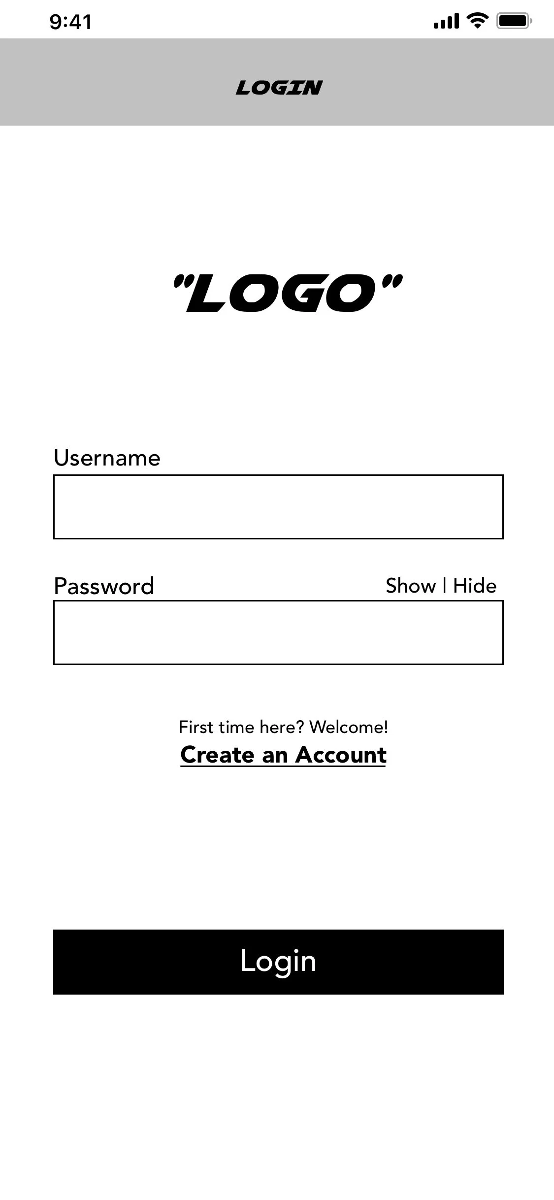
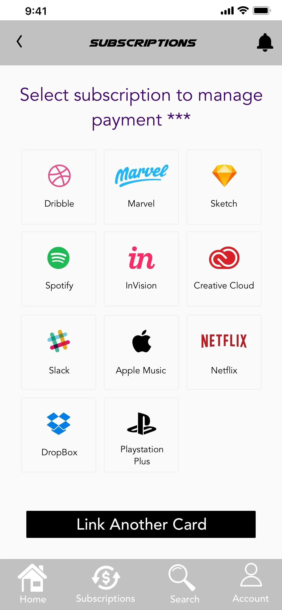
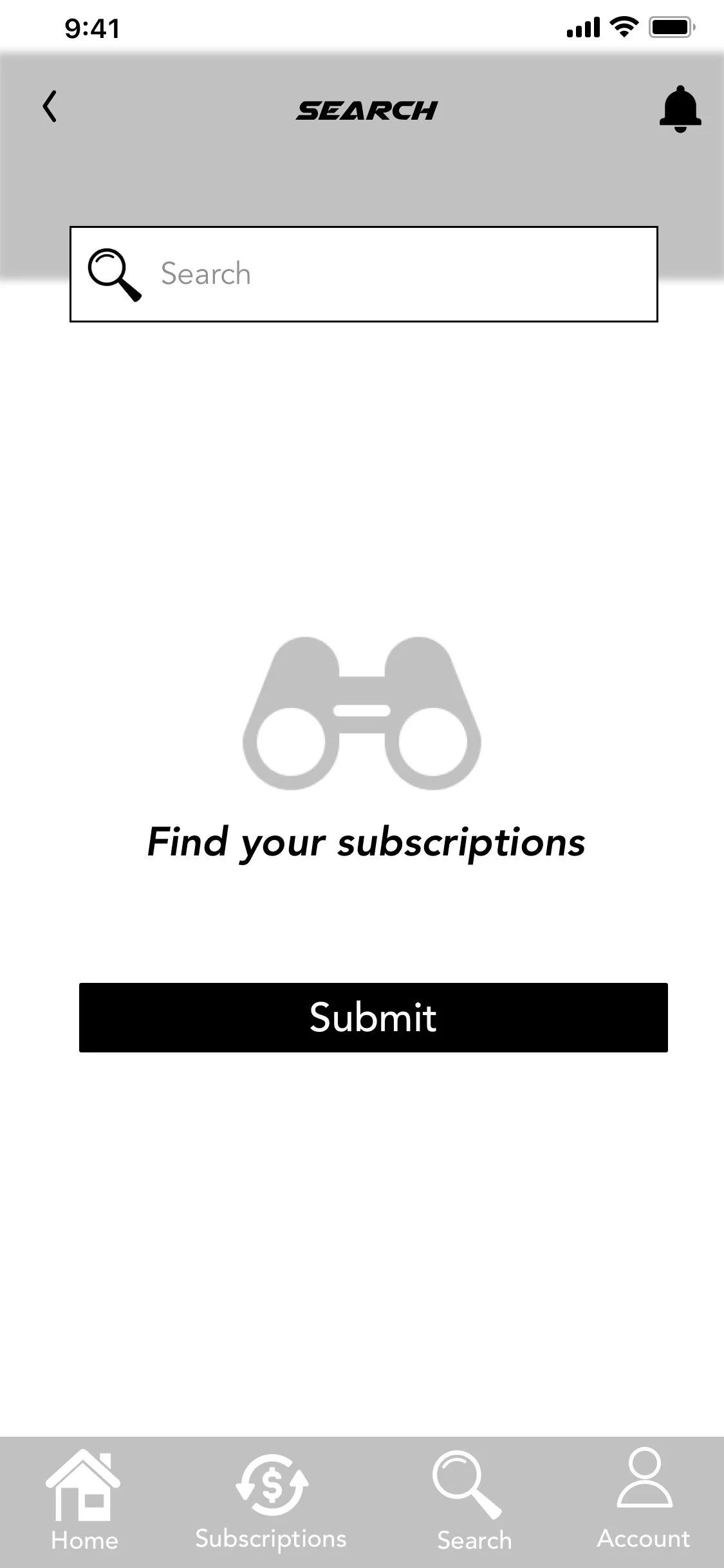
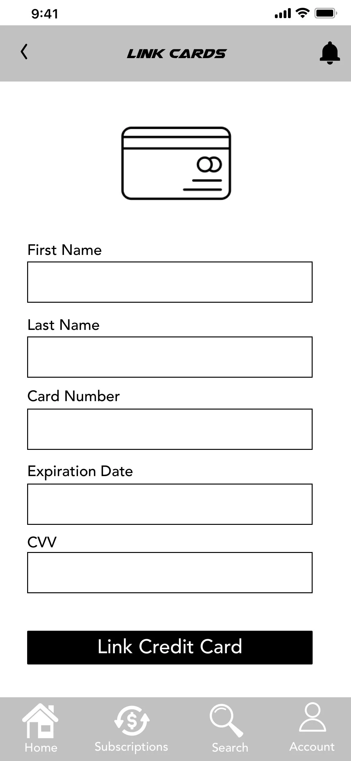
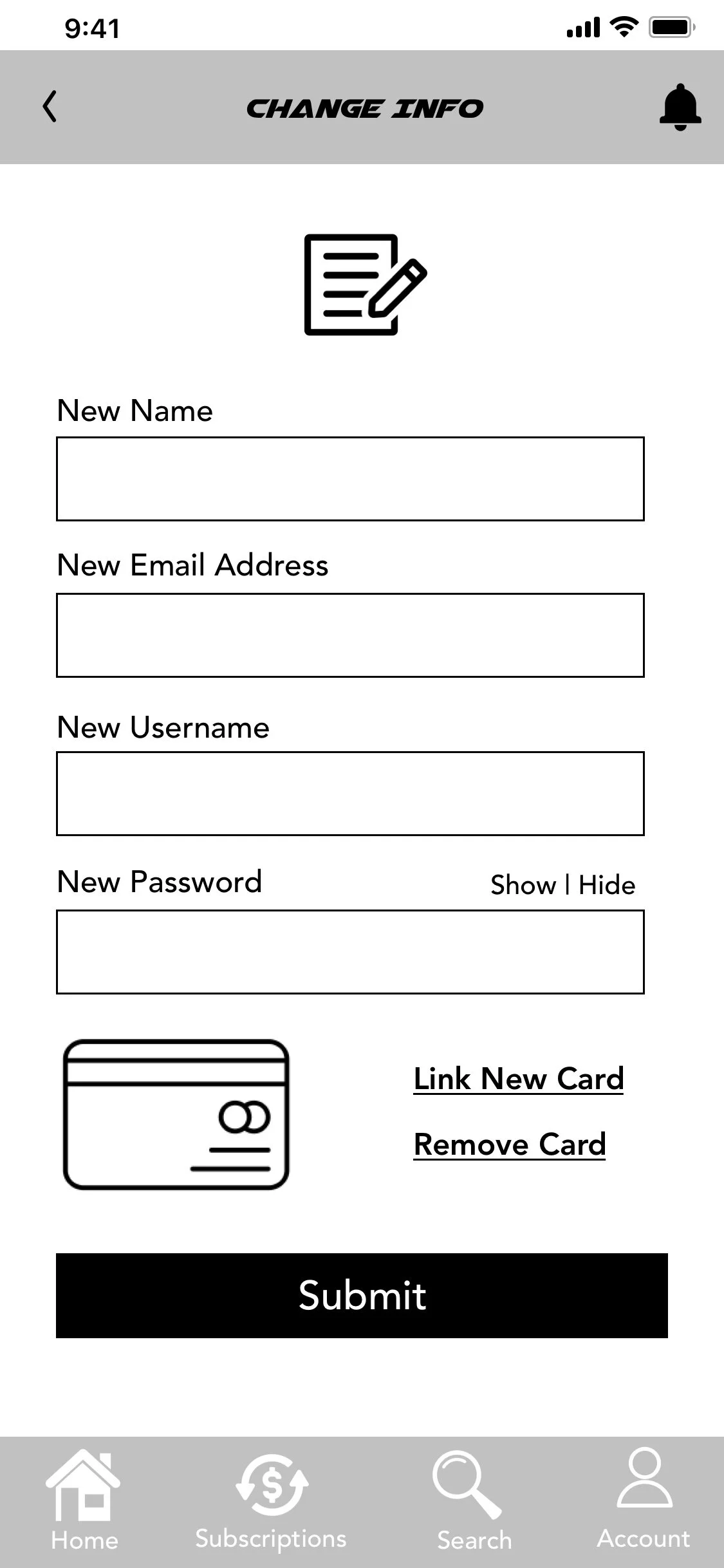
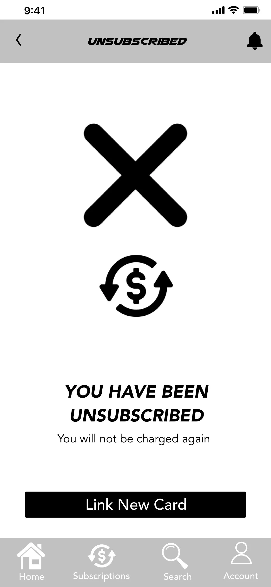
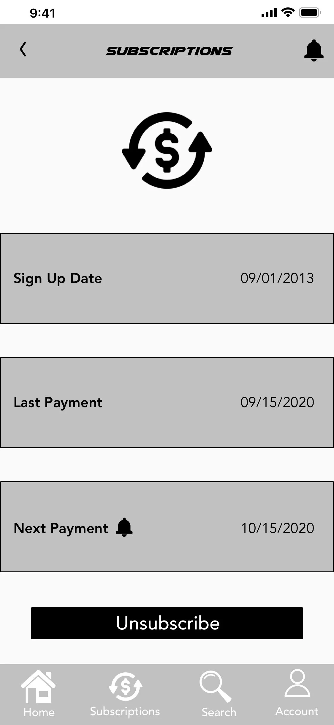
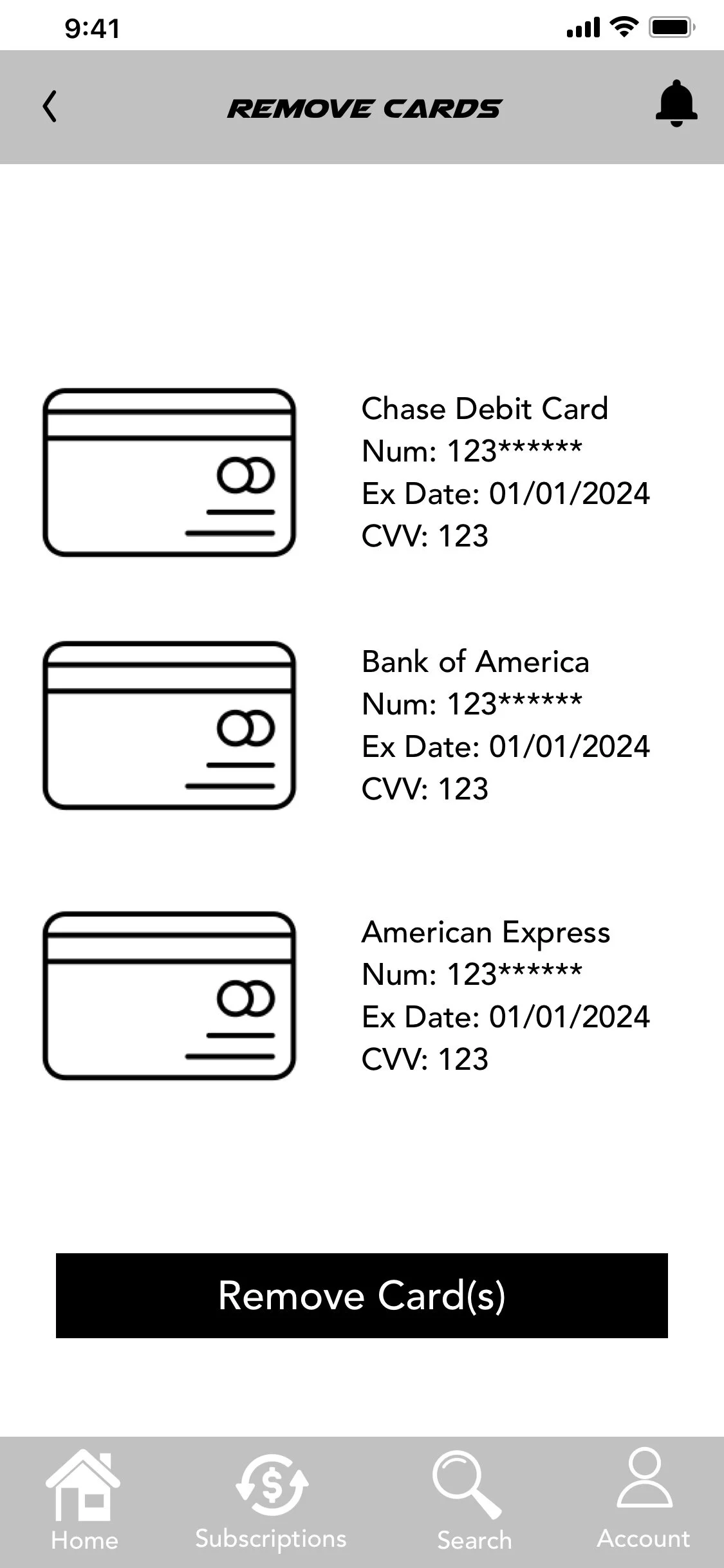
Wireframes
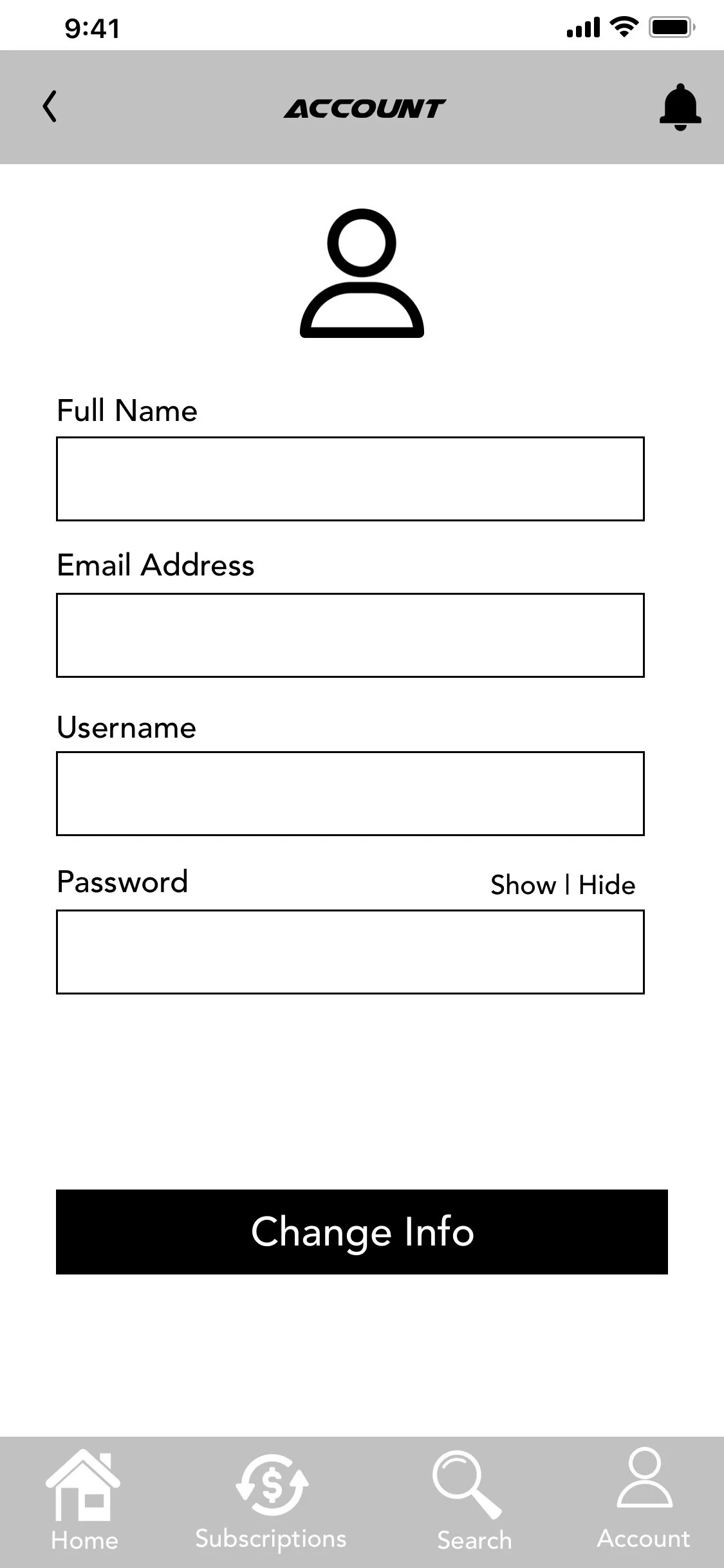
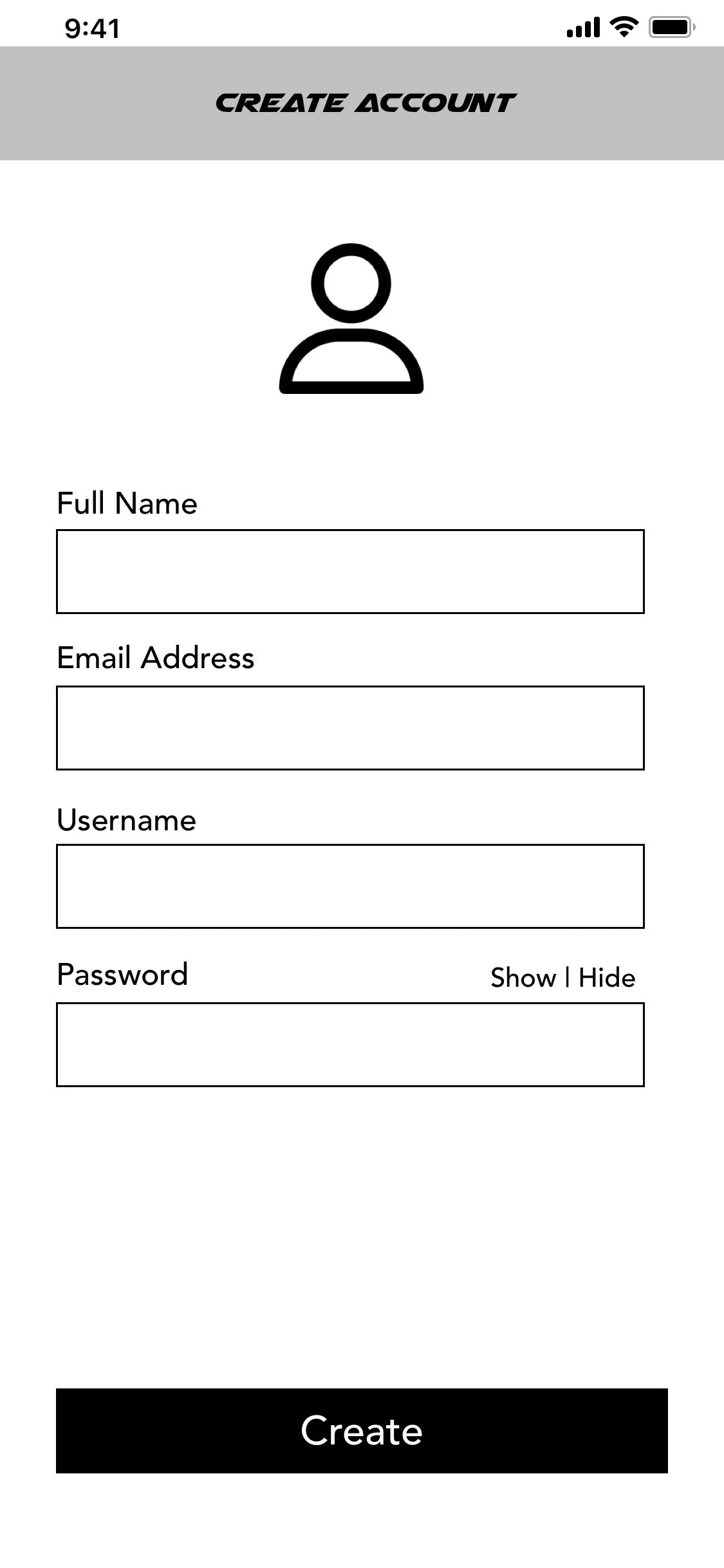
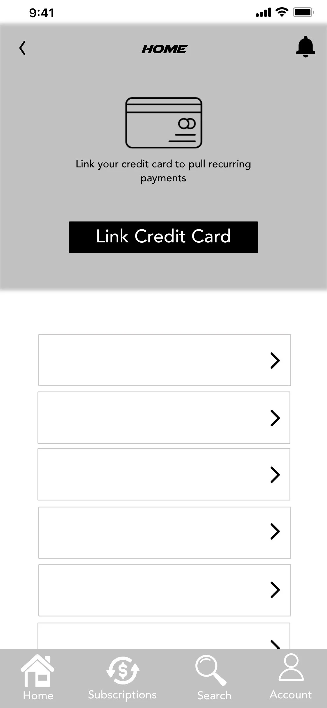
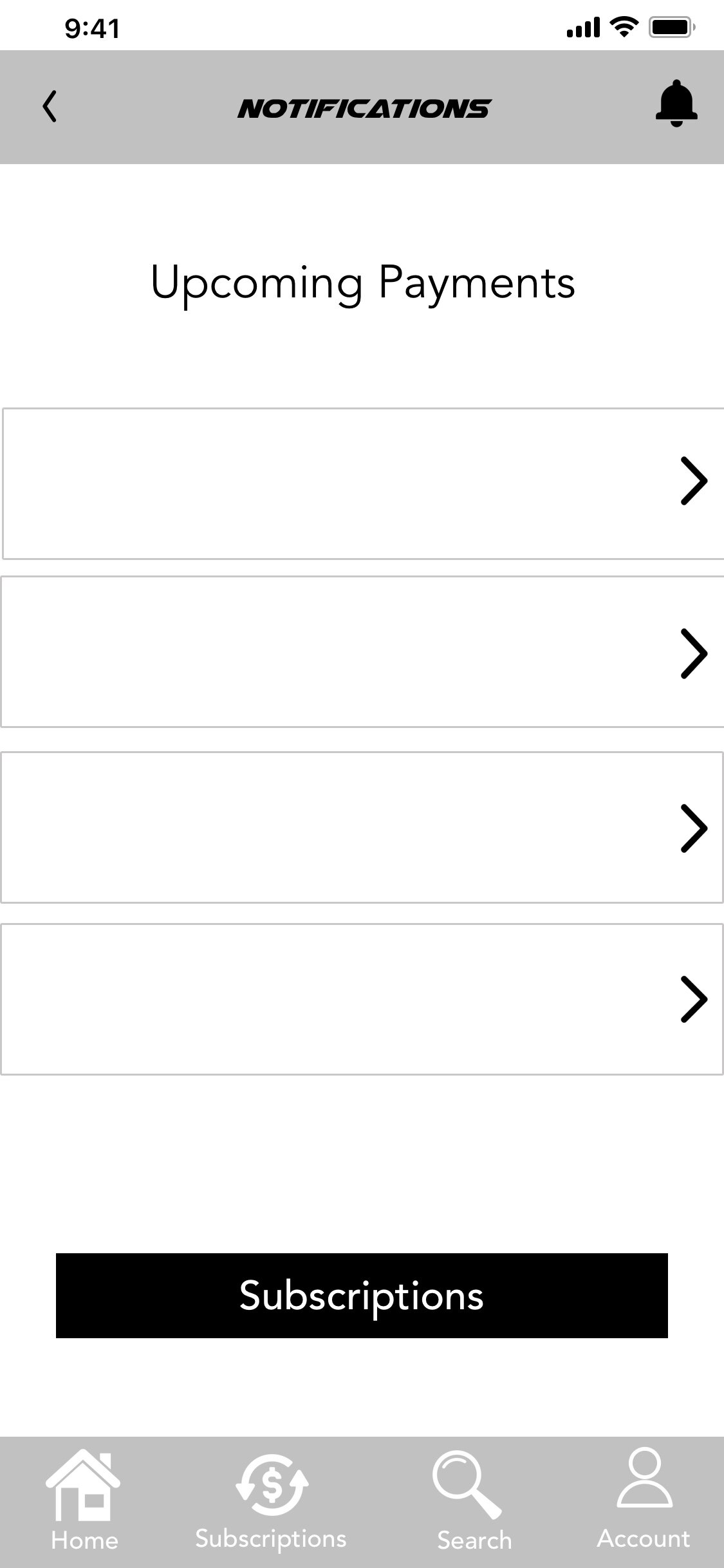
UI Elements
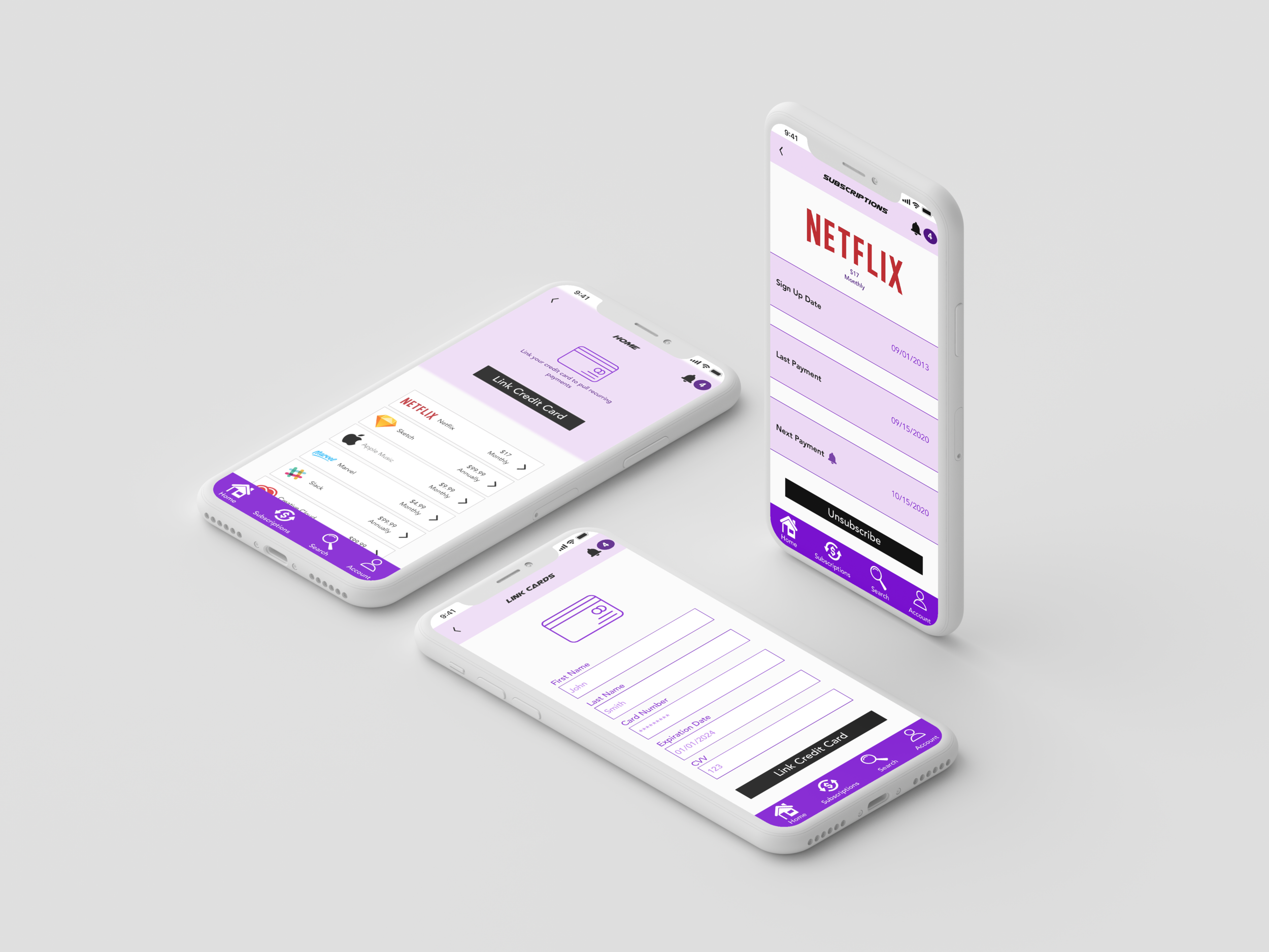
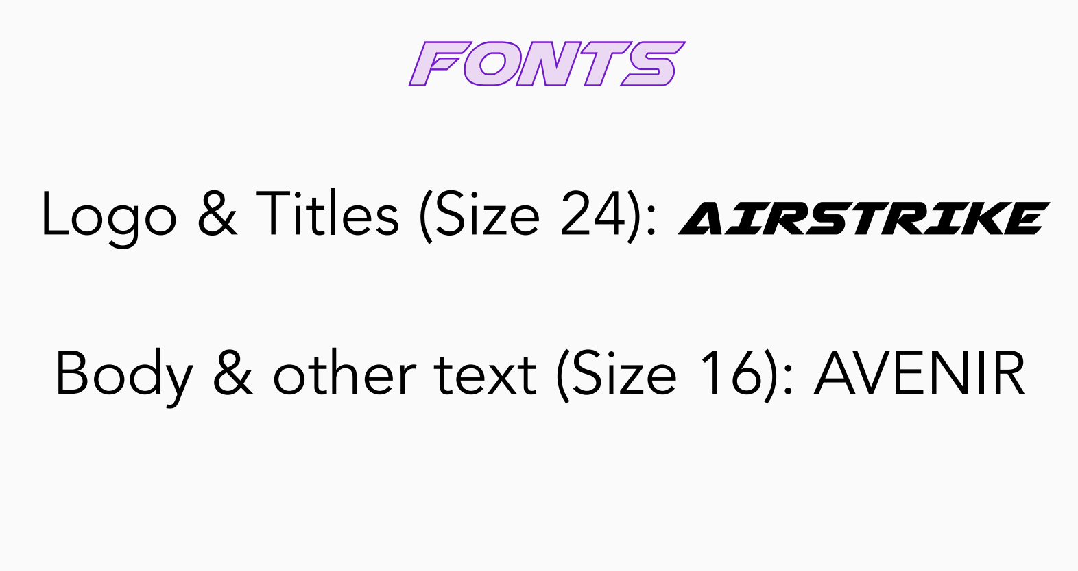
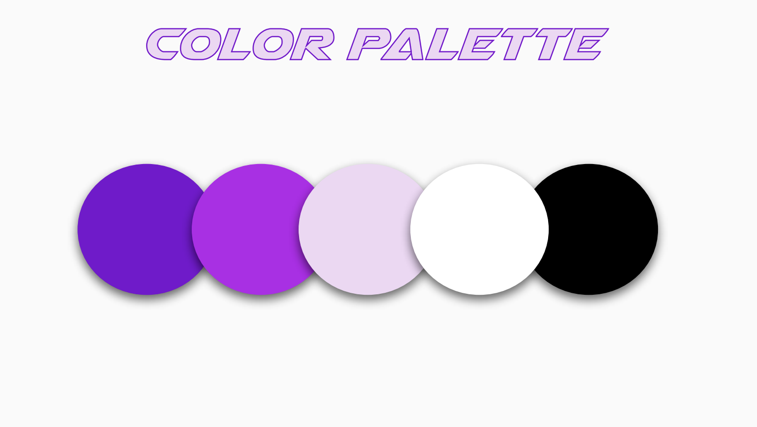
For the UI of UNSUBSCRIBED we wanted to go for a bright but not too bright color palette. We decided to go with different shades of purple as purple represents wealth, royalty, wisdom and devotion. All of these emotions and attributes are what we want our users to feel while they are experiencing our application. We also went for the most aesthetically pleasing fonts and sizes we could think of.
Mockups/Prototype
Usability Testing

The usability testing process was done with a total of ten people. The initial process included five individuals, all of who had subscription services. We wanted to get the viewpoint from everyone possible, from all walks of life. The testing was moderated both done remotely and in person. The testing opened our eyes to what needed to be changed as far as the design of the application.
We did this testing this way because we wanted to be hands on with the testing and be able to ask the participants questions along the way. It really allowed us to gauge how users will maneuver through the application.
There weren't any major changes that needed to be made. The only issue that came up was the fact that users could not find notifications easily enough. That was changed by adding a number marker next to the notification bell.
Takeaways
Overall this project was faster than the first one but still was very informative. The overall problem was to help save users money by creating a one stop shop for them to organize their monthly subscriptions. This is a problem that is very common amongst most people and needs resolution.
This was another project that had me handling every process every step along the way. The steps were not as extensive but it involved everything from research to usability testing.